Thread
A dark pattern is when a product’s design tricks you into doing something (like stopping you from cancelling a subscription).
Here are the five biggest dark patterns that I have noticed from large companies.
All of these are still live as I write this:
Here are the five biggest dark patterns that I have noticed from large companies.
All of these are still live as I write this:
1. Cancel by registered mail. No online option available.
Guilty company: @PlanetFitness
In 2022, you can’t cancel your gym membership online. To cancel remotely, you have to mail in a letter by registered mail.
Young people have no idea what a stamp even is
Guilty company: @PlanetFitness
In 2022, you can’t cancel your gym membership online. To cancel remotely, you have to mail in a letter by registered mail.
Young people have no idea what a stamp even is
2. Instant loss of access when cancelling a free trial.
Guilty Company: @Hulu
You would think that you would at least get to finish a free trial, even if you turn off auto renew.
Hulu disagrees. They revoke access the second you cancel, so people leave it and forget.
Guilty Company: @Hulu
You would think that you would at least get to finish a free trial, even if you turn off auto renew.
Hulu disagrees. They revoke access the second you cancel, so people leave it and forget.
3. Bait and switch pricing.
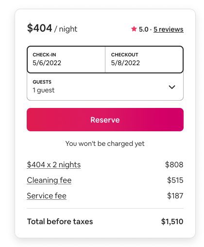
Guilty Company: @Airbnb
This is an example everyone is familiar with.
$500 cleaning fee on a $400/night listing. Plus $200 service fee. Final per night cost is therefore 88% higher than the listed nightly amount.
Guilty Company: @Airbnb
This is an example everyone is familiar with.
$500 cleaning fee on a $400/night listing. Plus $200 service fee. Final per night cost is therefore 88% higher than the listed nightly amount.
4. Unusable Cancellation Links.
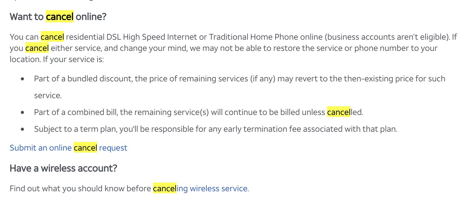
Guilty Company: @ATT
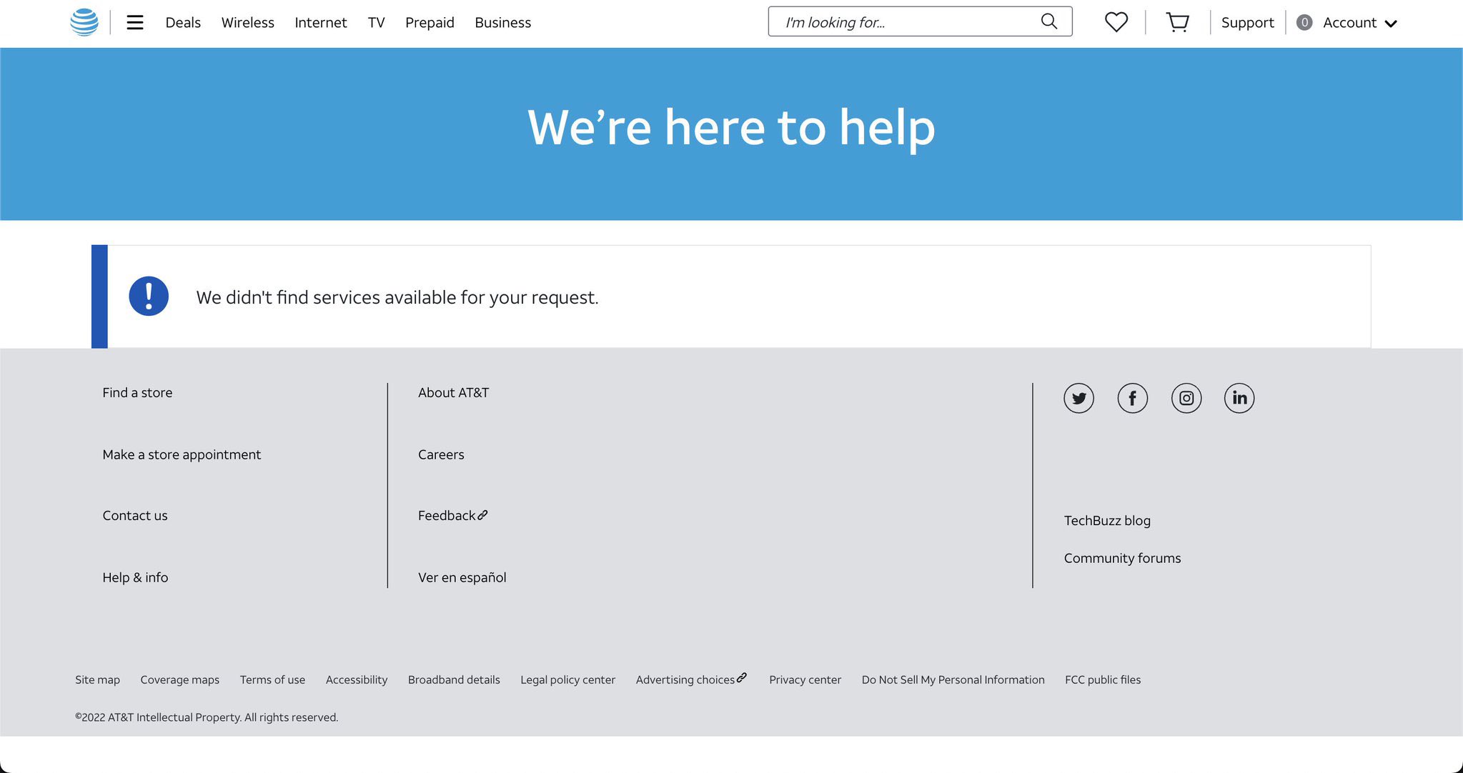
Everything else on the website works perfectly, but on AT&T, the cancellation link leads to a dead end.
Consumers get frustrated and forget to cancel.
Guilty Company: @ATT
Everything else on the website works perfectly, but on AT&T, the cancellation link leads to a dead end.
Consumers get frustrated and forget to cancel.
5. Deceptive Gifts and Payments.
Guilty Company: @United
When your flight is cancelled or delayed, United is quick to offer you a travel credit as compensation.
What they fail to discuss is that you are legally entitled to a cash refund. You give up your right when you accept.
Guilty Company: @United
When your flight is cancelled or delayed, United is quick to offer you a travel credit as compensation.
What they fail to discuss is that you are legally entitled to a cash refund. You give up your right when you accept.
All of these practices should be illegal. We are working on building a “hall of shame” at DoNotPay to pressure hundreds of companies from removing their dark patterns!


