Thread
Are your Airbnb's a little....mehh, anon?
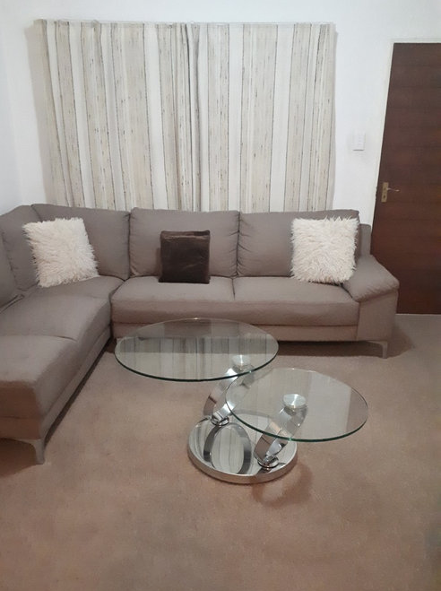
Is your home a normie haven of Target throw pillows, gray microfiber furniture & shame?
Fear not!
Here's 15 simple fixes you can jump on, right now, to turn away from a basic past & embrace a whole new you:
Is your home a normie haven of Target throw pillows, gray microfiber furniture & shame?
Fear not!
Here's 15 simple fixes you can jump on, right now, to turn away from a basic past & embrace a whole new you:
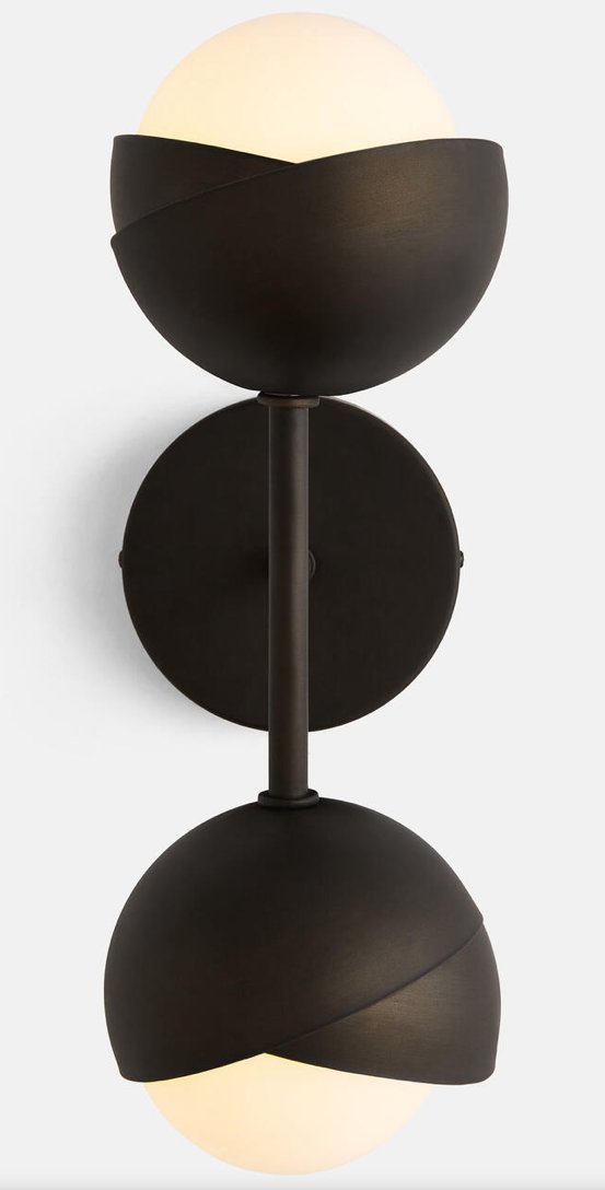
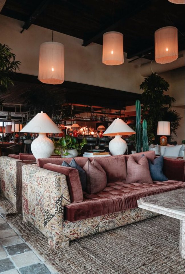
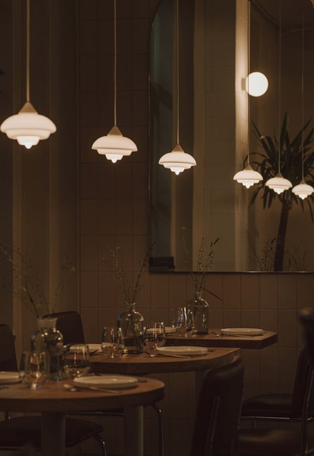
1. Change all your light fixtures - will do wonders & doesn't have to be expensive! Ask me for my two cents if you are struggling on picks.
Lights are illuminated sculptural art, they matter, and you deserve more than boob lights from Home Depot!
Lights are illuminated sculptural art, they matter, and you deserve more than boob lights from Home Depot!
2. Plants
Looking at plants makes people feel calm & content. It's just science, man.
Plus they are a living sculpture and your guests will be impressed that you can keep plants alive (and they could even be fake shhh)
Pro Tip: like most decor items, they should be BIG.
Looking at plants makes people feel calm & content. It's just science, man.
Plus they are a living sculpture and your guests will be impressed that you can keep plants alive (and they could even be fake shhh)
Pro Tip: like most decor items, they should be BIG.
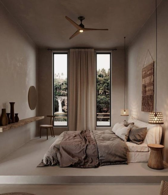
3. Hang Curtains Really High
Have you ever hung curtains, but high?
This makes your ceilings seem higher, and your room seem bigger.
Curtains make things look more...elevated and intentional.
Have you ever hung curtains, but high?
This makes your ceilings seem higher, and your room seem bigger.
Curtains make things look more...elevated and intentional.
4. Layer that Lighting
Do Not just use overhead lighting. Walls sconces are the best if you can swing it, but also reading lamps & floor lamps & lanterns are great.
The key concept: A variety of different lighting at different heights.
Do Not just use overhead lighting. Walls sconces are the best if you can swing it, but also reading lamps & floor lamps & lanterns are great.
The key concept: A variety of different lighting at different heights.
5. Go nuts in one bathroom - take chances.
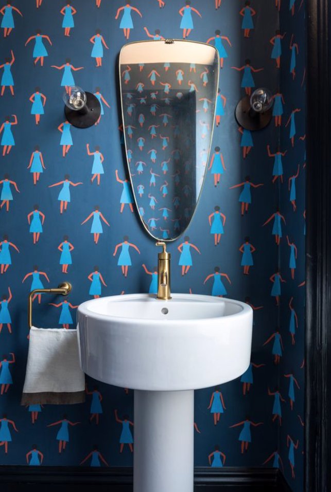
Wallpaper, crazy mirror, weird faucet, loud tile etc. Just create a tight color pallet and follow it - 3 or 4 colors.
Both #1 & #2 guests will be tickled.
I have a swan faucet in my house and everyone comments on it.
Wallpaper, crazy mirror, weird faucet, loud tile etc. Just create a tight color pallet and follow it - 3 or 4 colors.
Both #1 & #2 guests will be tickled.
I have a swan faucet in my house and everyone comments on it.
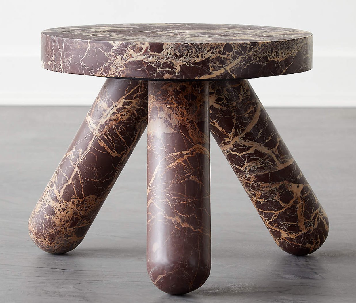
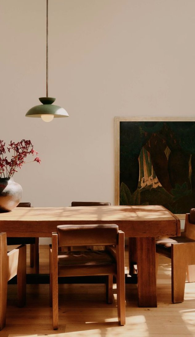
6. Create a focal point in your living room/dining room.
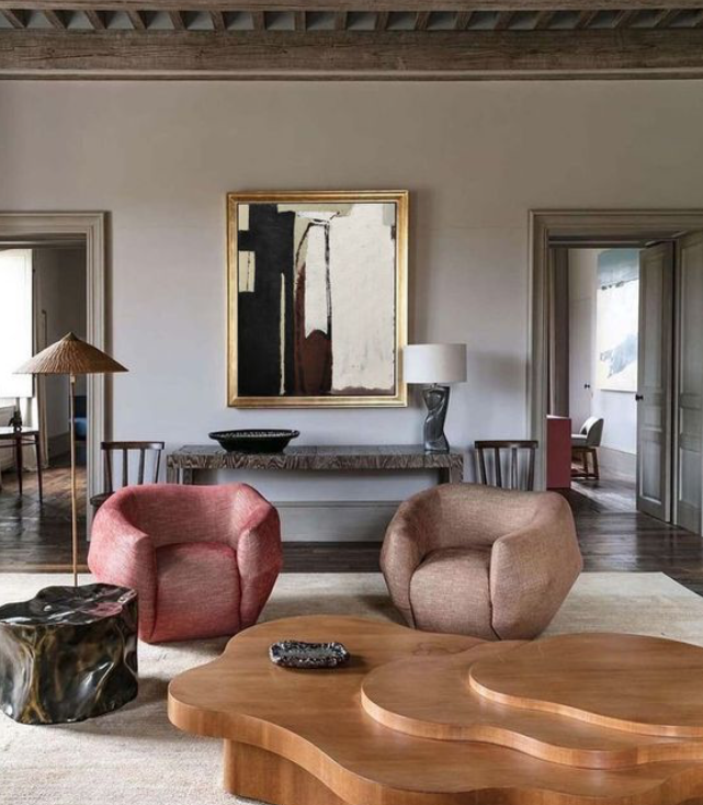
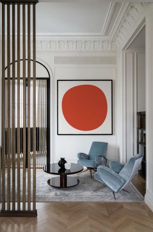
Could be a chandelier, or a coffee table or a piece of art. Choose something that demands attention and then build the rest of the room around it.
Could be a chandelier, or a coffee table or a piece of art. Choose something that demands attention and then build the rest of the room around it.
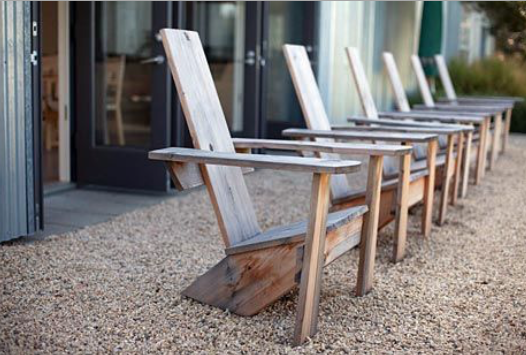
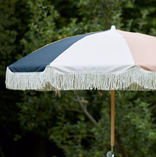
7. Make your yard better, it probably could use it!
One thing that looks really good in a backyard is 3+ of the same chairs.
Umbrellas are great too - the camera loves an umbrella.
You should "stage" your backyard similar to living room. Treat it like a room
One thing that looks really good in a backyard is 3+ of the same chairs.
Umbrellas are great too - the camera loves an umbrella.
You should "stage" your backyard similar to living room. Treat it like a room
8. Find a way to bring in natural materials. Wood, Stone, Marble have a timeless & calming appeal and stand out in a sea of cheap microfiber furniture & vinyl floors.
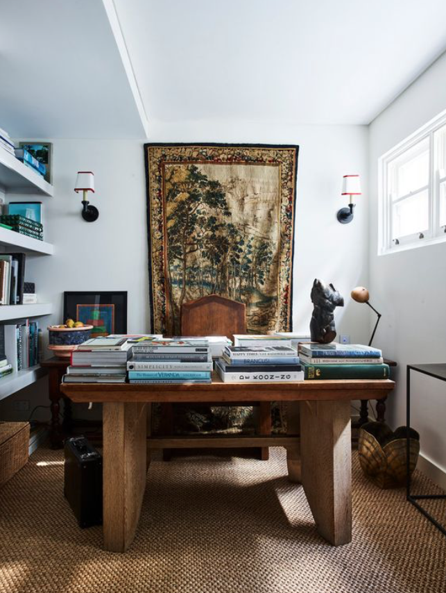
9. Blend New & Old
When everything in a house is new, it's got no vibe, just that same-time-period-ness.
When everything is old, it looks like your grandmother's.
IMHO, ratio should be about 50/50. This is what the best designers do.
When everything in a house is new, it's got no vibe, just that same-time-period-ness.
When everything is old, it looks like your grandmother's.
IMHO, ratio should be about 50/50. This is what the best designers do.
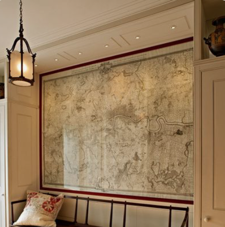
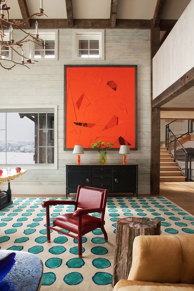
10. Huge Art
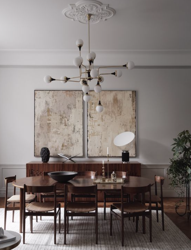
"Art" is subjective here. I've seen big driftwood displayed that looks pretty great. Also a huge vintage map can really work.
Key here is size - you want your "art" to take up a bunch of the wall space - it creates the illusion the room is bigger than it is.
"Art" is subjective here. I've seen big driftwood displayed that looks pretty great. Also a huge vintage map can really work.
Key here is size - you want your "art" to take up a bunch of the wall space - it creates the illusion the room is bigger than it is.
11. Break up your seating.
Matching furniture is an easy choice, but it tends to get pretty boring. Leaning into the new-old thing, having furniture from different eras is really sharp and creates so much more visual interest
Matching furniture is an easy choice, but it tends to get pretty boring. Leaning into the new-old thing, having furniture from different eras is really sharp and creates so much more visual interest
12. Dimmers
The modern candle is the dimmer switch.
Nothing "sets the mood" like being able to quite literally, manually, set the mood. Slide your fingers for instant vibe shift.
It's electric, baby.
Put everything you can on a dimmer. Use warm light bulbs.
The modern candle is the dimmer switch.
Nothing "sets the mood" like being able to quite literally, manually, set the mood. Slide your fingers for instant vibe shift.
It's electric, baby.
Put everything you can on a dimmer. Use warm light bulbs.
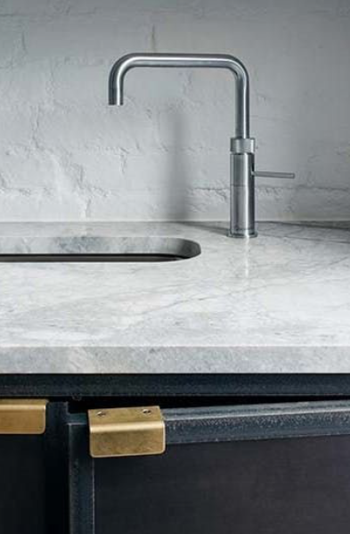
13. Mix Metals
Always weird to me in a newer homes when all fixtures & hardware are "stainless" and no other material is used. Feels cold.
Warm brass looks great with nickel which looks great with black. Switch it up.
Always weird to me in a newer homes when all fixtures & hardware are "stainless" and no other material is used. Feels cold.
Warm brass looks great with nickel which looks great with black. Switch it up.
14. No objects smaller than a cantaloupe
This is an old realtor rule for selling homes, but it's totally true. Anything smaller looks cluttered and unintentional.
This is an old realtor rule for selling homes, but it's totally true. Anything smaller looks cluttered and unintentional.
15. Color
Allow one major piece of each room to be fully saturated with color. It makes people happy & creates dynamics & prevents the "washed out, samey" feel.
Allow one major piece of each room to be fully saturated with color. It makes people happy & creates dynamics & prevents the "washed out, samey" feel.
That's a wrap!
If you enjoyed this thread:
1. Follow me @hanslorei for more STR + design tweets.
2. RT the tweet below to share this thread with your audience
If you enjoyed this thread:
1. Follow me @hanslorei for more STR + design tweets.
2. RT the tweet below to share this thread with your audience
Mentions
See All
Nathan Barry @nathanbarry
·
Mar 26, 2023
Great thread.
