Thread by Kristine Kolodziejski || MVP || #PrinCSS
- Tweet
- Mar 20, 2023
- #Design #Mobileappdevelopment #UserExperience
Thread
New content alert 🚨
I love Twitter threads for straight to the point content from my favourite people, and have decided to launch my own 😎
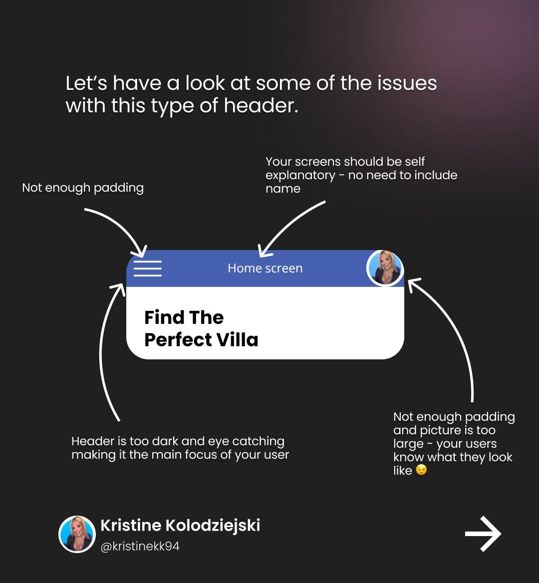
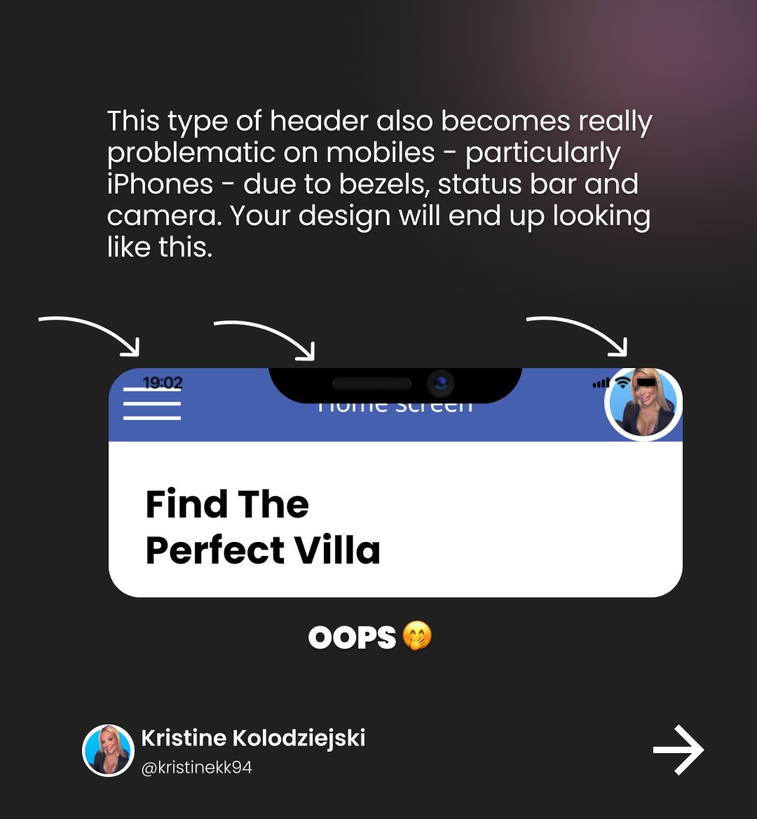
In our first one, we look at app headers and why you should stop doing this ONE thing 🚀
#PowerPlatform #UIUX
I love Twitter threads for straight to the point content from my favourite people, and have decided to launch my own 😎
In our first one, we look at app headers and why you should stop doing this ONE thing 🚀
#PowerPlatform #UIUX
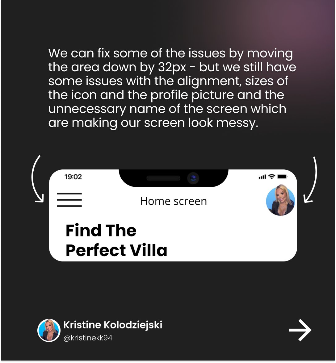
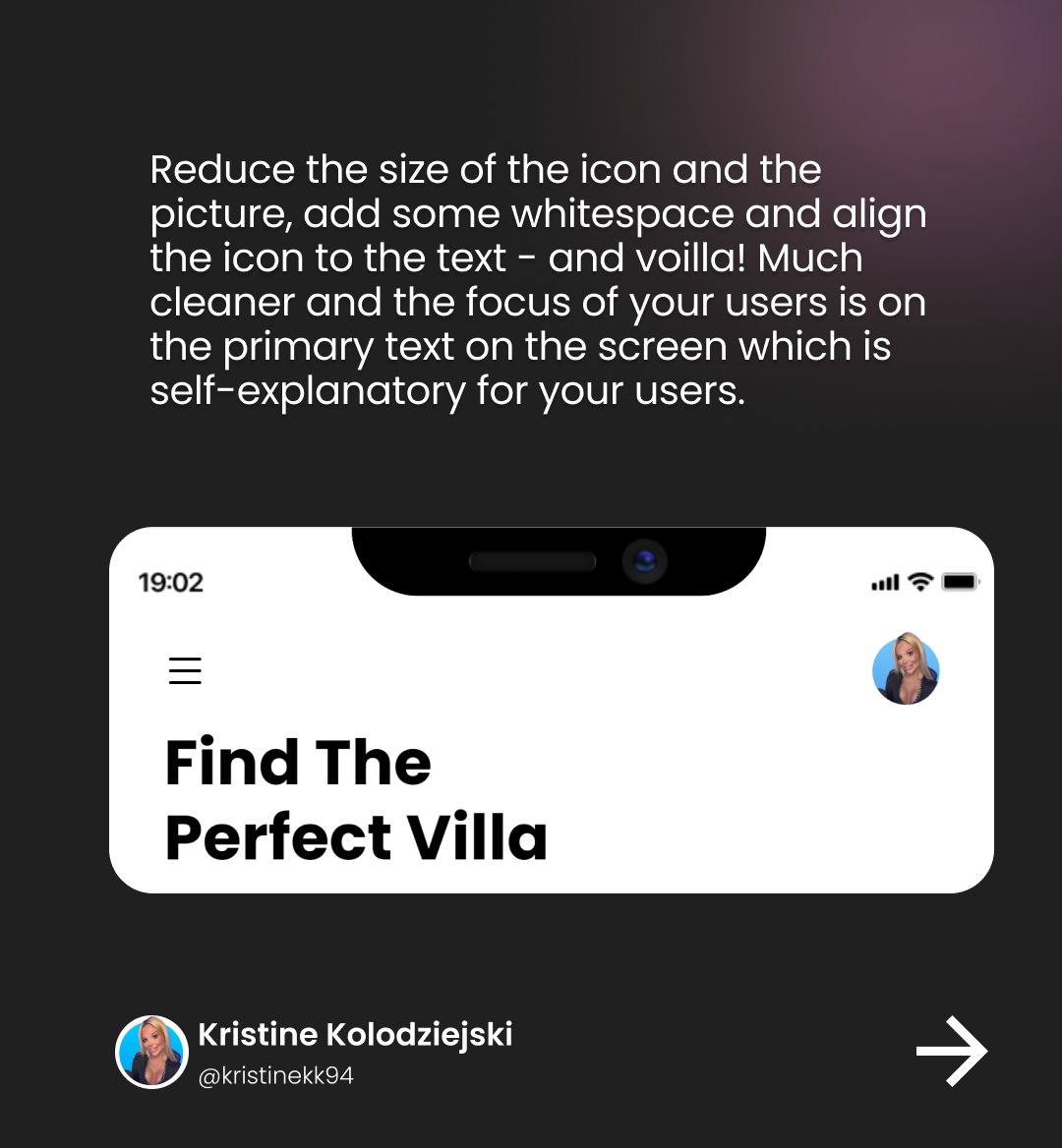
Moving the heather down and making it transparent does resolve a few issues but it's still not great.. 🤐
I've also added it to my blog so it doesn't get lost in the Twitter galaxy 😎www.kristinekolodziejski.com/blog/5wmoiqd4ml71c52teafp1i0emobhky
Mentions
See All
Michal Malewicz @michalmalewicz
·
Mar 20, 2023
What an awesome thread! ☝️
